CHALLENGE
An oversaturated and outspending market
Johns Hopkins is one of the most prestigious health systems in the world. With leading physicians in their field, this historic brand is behind some of the most important advancements in medical research and one of the top 10 cancer institutions in the United States.
In the D.C. area, a high concentration of top-tier medical schools and providers create a lot of competition. Johns Hopkins is outspent 7 to 1 by some of its competitors who relay on a very similar visual identity.
FINDING A VOICE & LOOK
For Hopkins to standout in this environment we needed to find a
voice and distinctive look to make the refresh fitting for a healthcare leader.
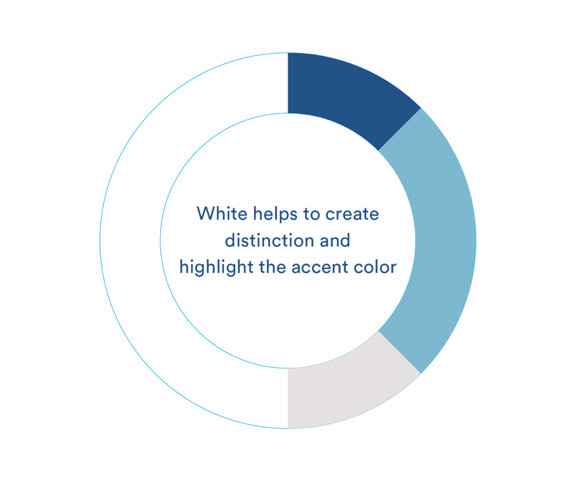
The same colors: blues, yellow and gray, with traditional fonts
are used by every major competitor in D.C
voice and distinctive look to make the refresh fitting for a healthcare leader.
The same colors: blues, yellow and gray, with traditional fonts
are used by every major competitor in D.C


SOLUTION
Find a voice and a look and feel
A brand refresh that marries the values Hopkins is built on with an updated, modern look and feel.
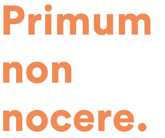
Their refreshed brand identity was built around the internal statement: The Promise Of Medicine.
Their refreshed brand identity was built around the internal statement: The Promise Of Medicine.
The value Johns Hopkins Medicine brings and The Promise of Medicine ultimately expresses, is that no matter what you come for, the same rigor and dedication is applied across the health system.
This position leverages the brand’s reputation of excellence while at the same time stressing innovation.